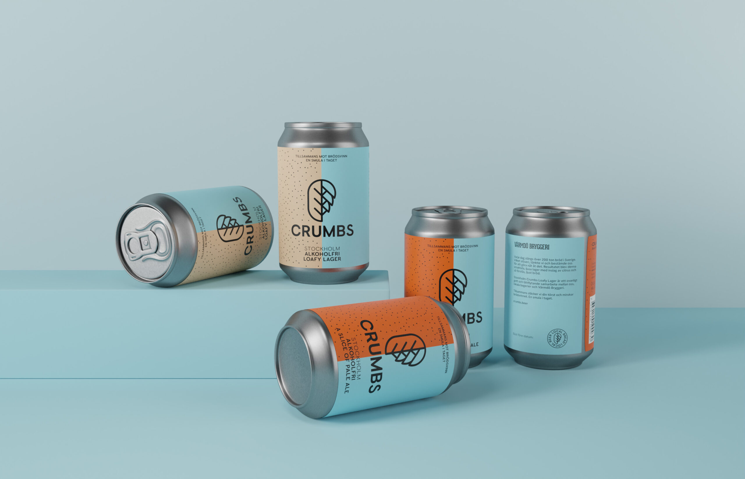
CRUMBS
BEER FROM BREAD, BRILLIANT! AN IDENTITY FOR SWEDENS FIRST BREAD BEER.

The brief
Sweden as a nation throw away over 200 tonnes of bread every day. That’s 72 slices a second. Crumbs is a beer that takes some of that waste and turns it into beer.We were asked to design a packaging concept and identity that would elevate the story behind Crumbs, the reasons for its existence and it’s greater mission.
The idea
The market is overloaded with trendy beer brands right now, and it would have been an easy route to follow, create some uber cool trendy label that all the beer hipsters could fall in love with. But in this case that approach wouldn’t work.
The idea was to design an identity that appealed to the masses rather than the individual. Crumbs are first and foremost about spreading awareness of the terrible food waste model that we currently follow, and secondly about producing lovely quality beer.
The result
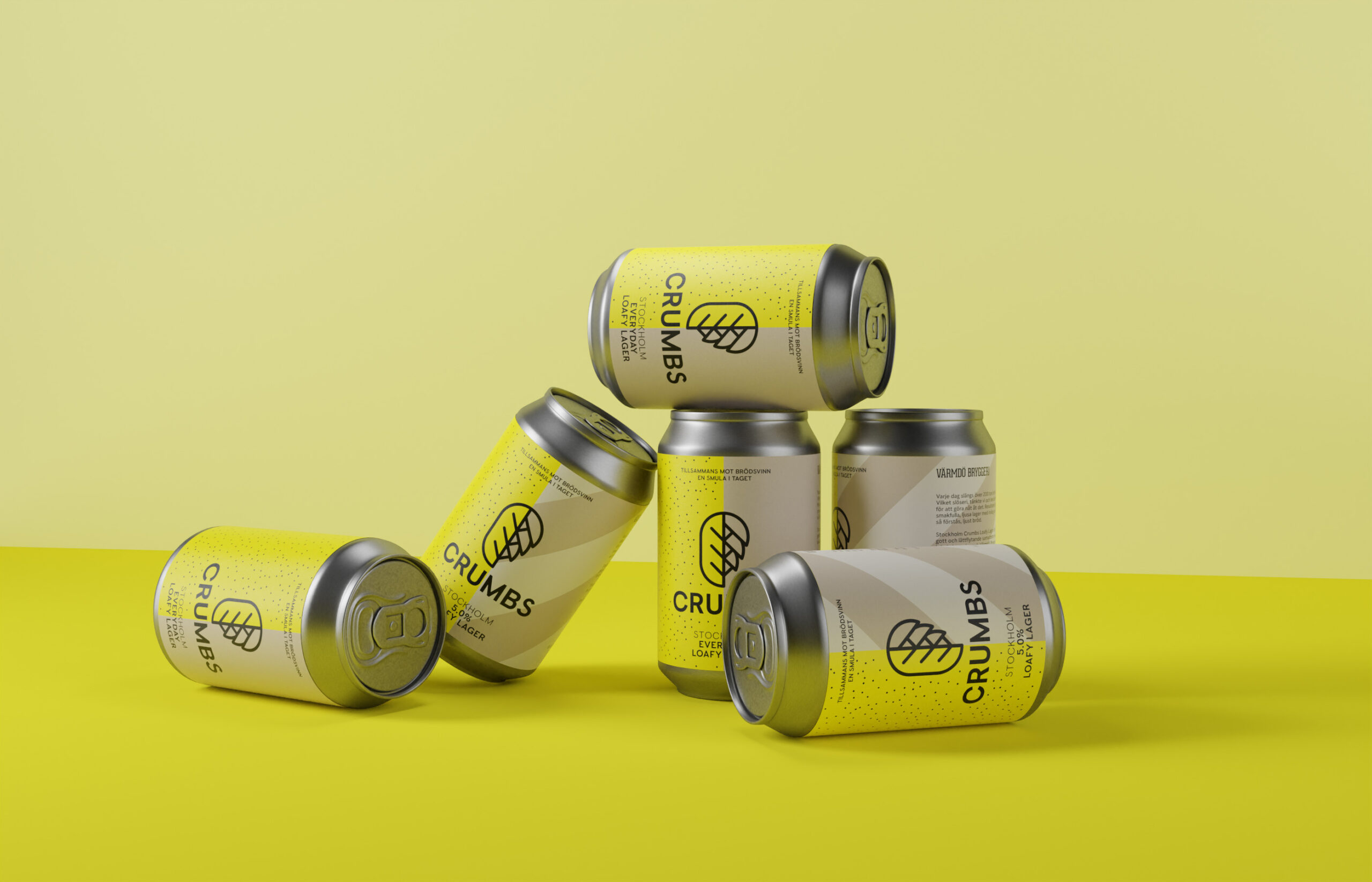
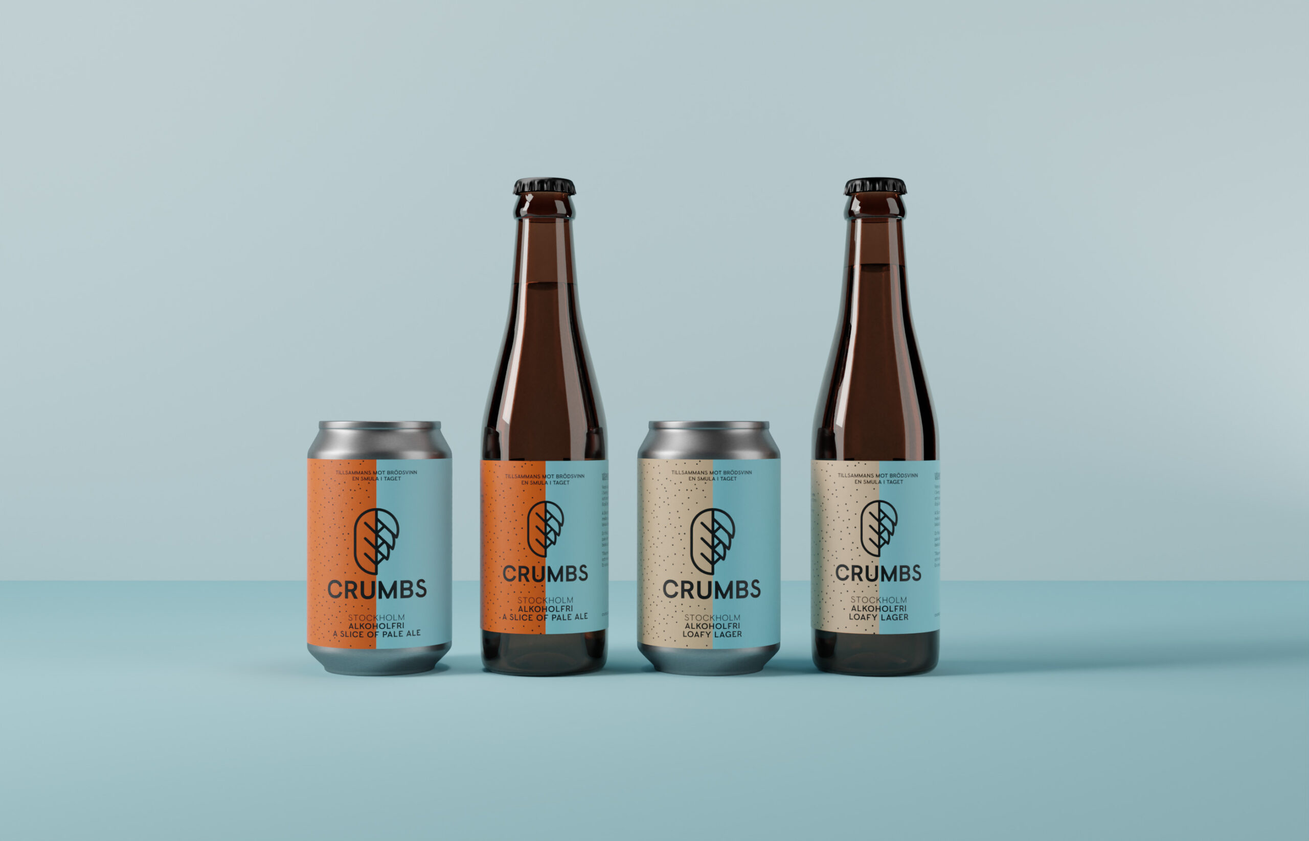
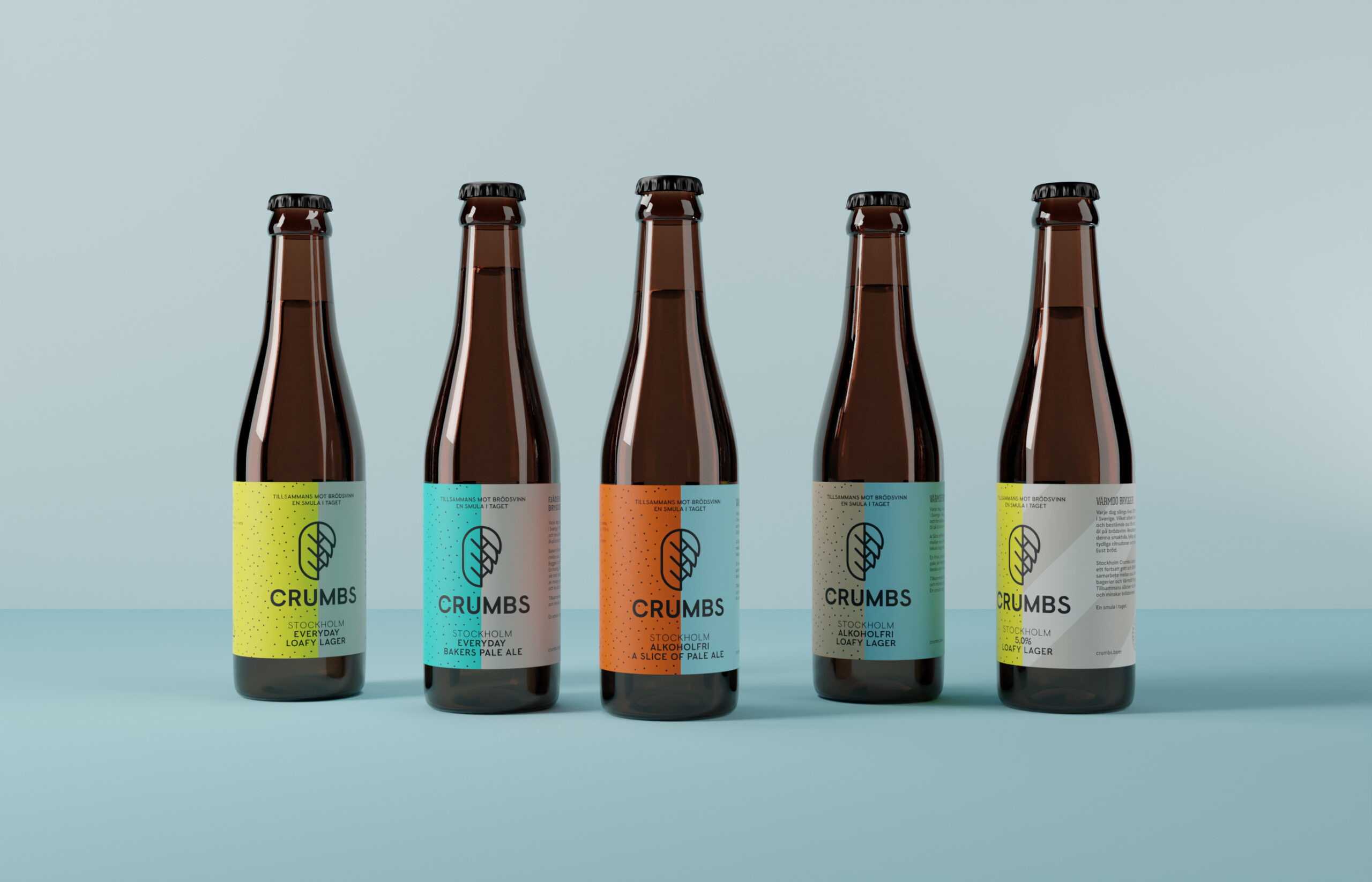
Crumbs identity is heavy on messaging, it needed to be in order for the brand to have any success in its mission. The graphic profile needed to be one of simplicity and one that would resonate with all types of people from the hipster beer lover to the occasional beer drinker at a weekend bbq.
KEEPING IT
LOCAL
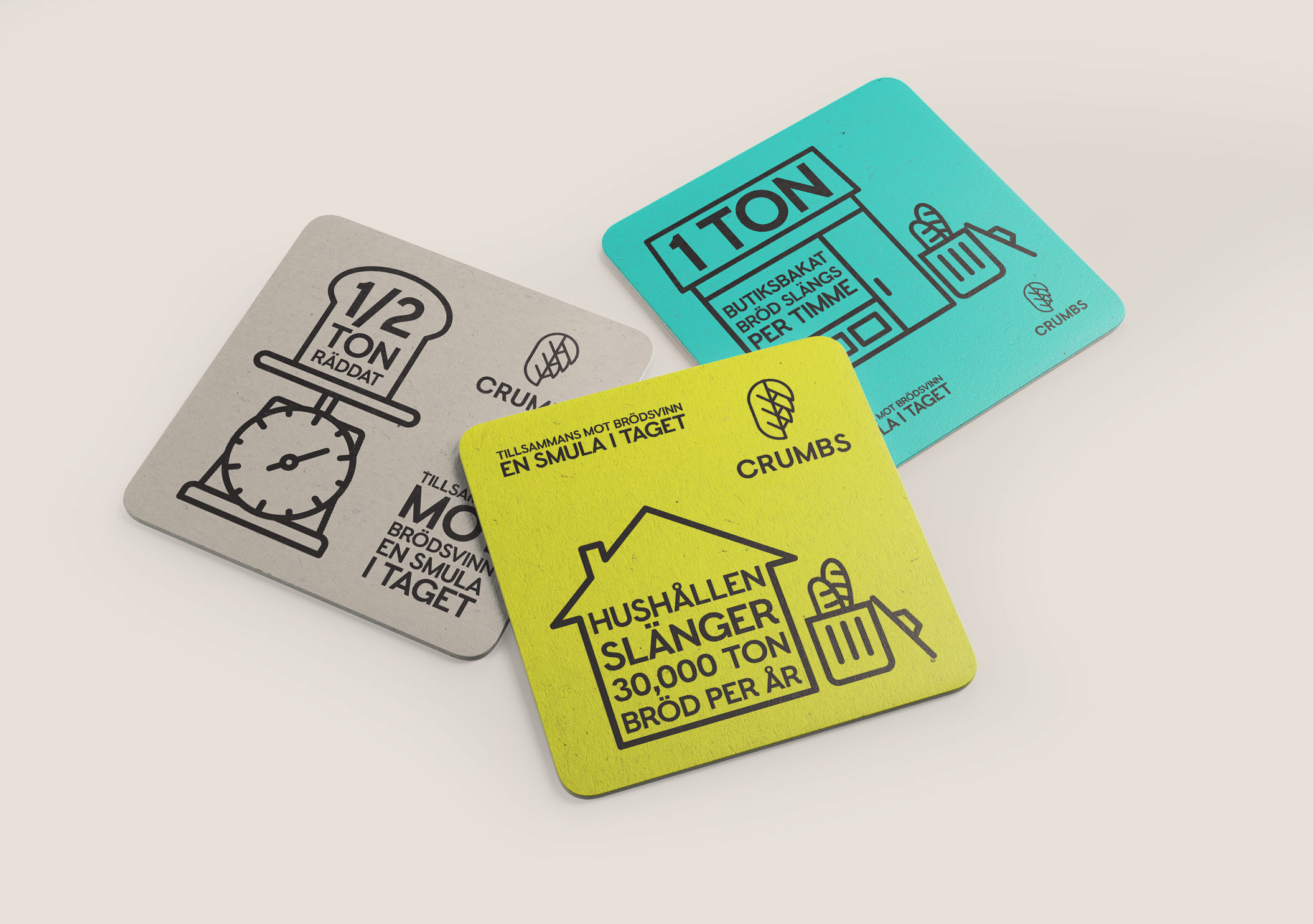
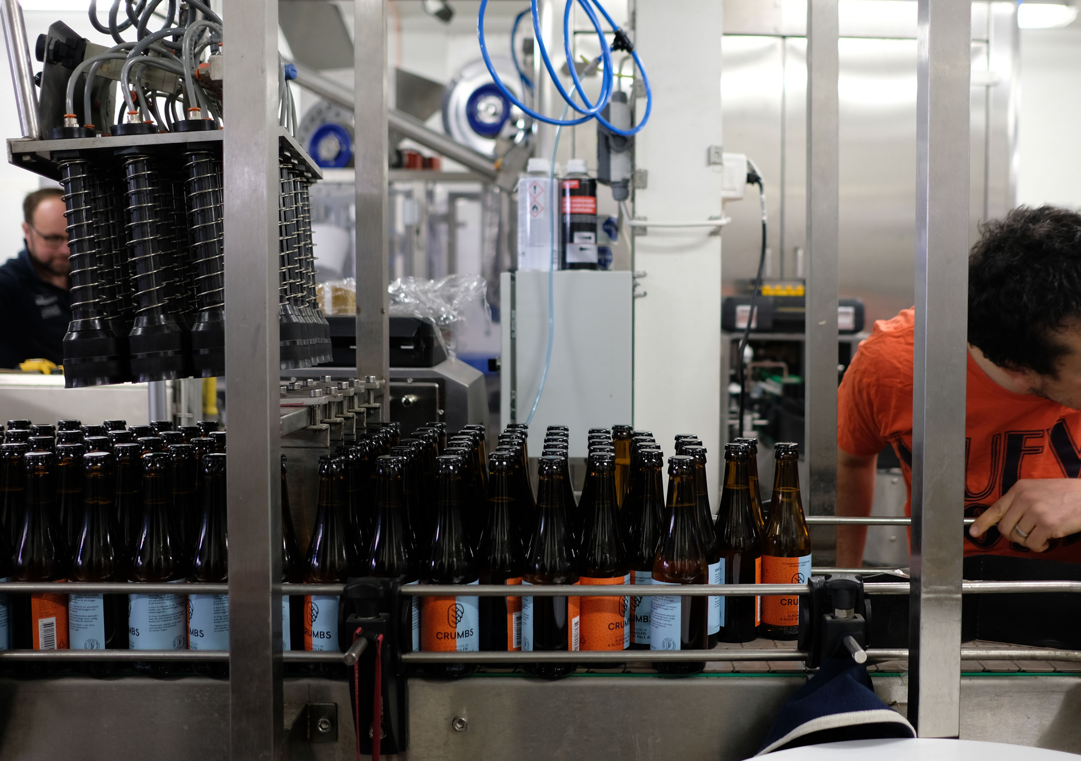
Crumbs circular model is based around locality. They source bread from local bakeries and brew with local breweries. We lifted this story on the side of the label. We also used merchandise to spread the facts about bread waste.

