GASTON LUGA
STRATEGIC AND VISUAL BRANDING FOR SWEDISH BASED LUGGAGE E-COMMERCE COMPANY.
The brief
Gaston Luga are producers of Scandinavian design inspired luggage with their main market being in Asia. With luggage continuing to change with the trends and the needs of the customer, and making its place amongst the main fashion brands we were asked to redefine Gaston Luga’s brand offering.
The idea
Gaston Luga had fallen a bit behind the times in terms of product offering and its visual appeal amongst its target audience. It was obvious that they were lacking the red line through all their communication. Our idea was to give the humble bag a purpose. One that the target audience could connect to. We introduced the idea that every time one travels from one place to the other is a journey, even the mundane, for instance going to the shop to buy bread. On every journey, Gaston Luga can offer you a bag specifically for that need.
The result
Something good must have come out of our journey with them as recently they announced that they have surpassed their main competitors in terms of revenue. Gaston Luga have and continue to implement their new brand platform and after keeping our eyes on them for the past few months it is obvious that good things are happening.

ALL ABOUT
THE JOURNEY
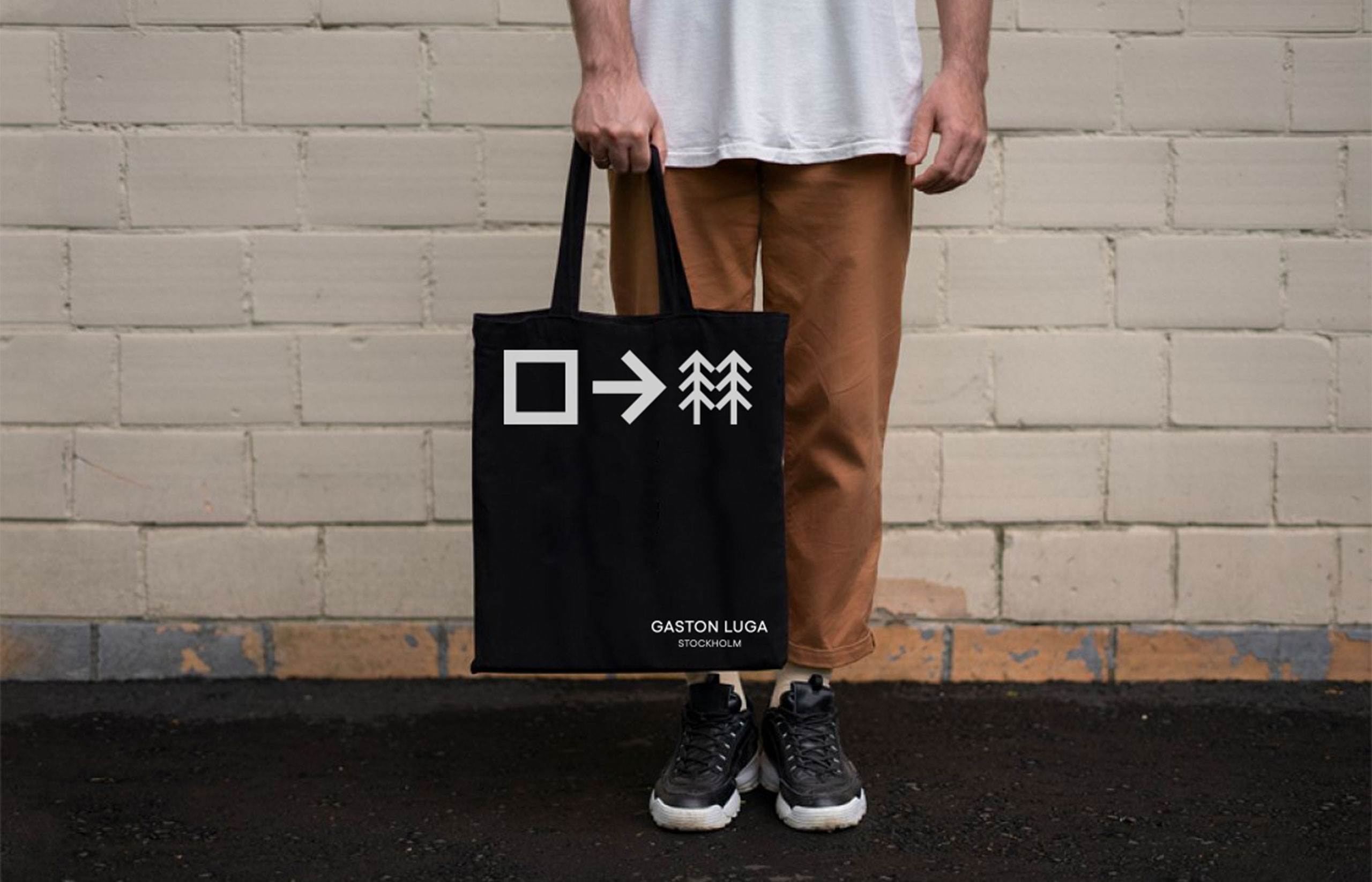
We simply refreshed the logotype but added a brand tagline that emphasised their brand vision.

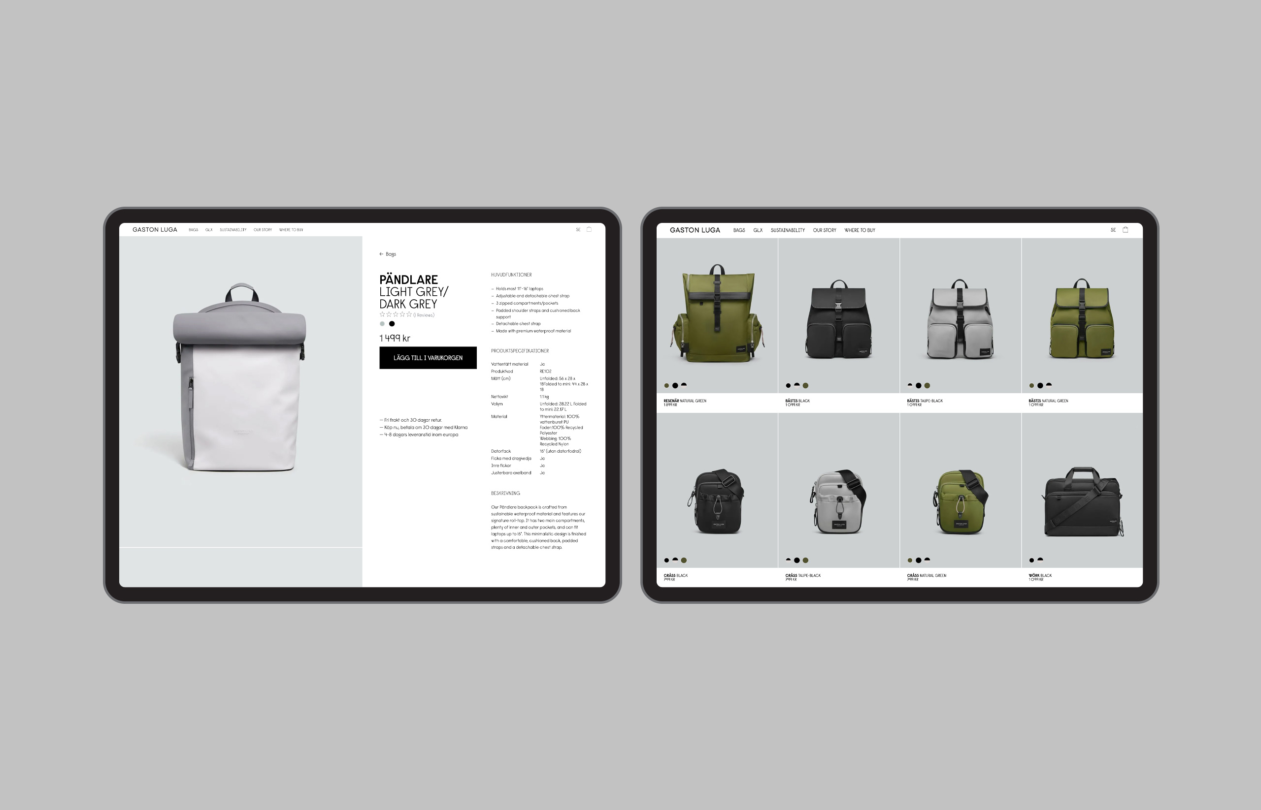
The design of their new e-commerce site was one of the first things that we worked on. I much cleaner, modern look and feel containing imagery and messaging that communicated their brand platform.


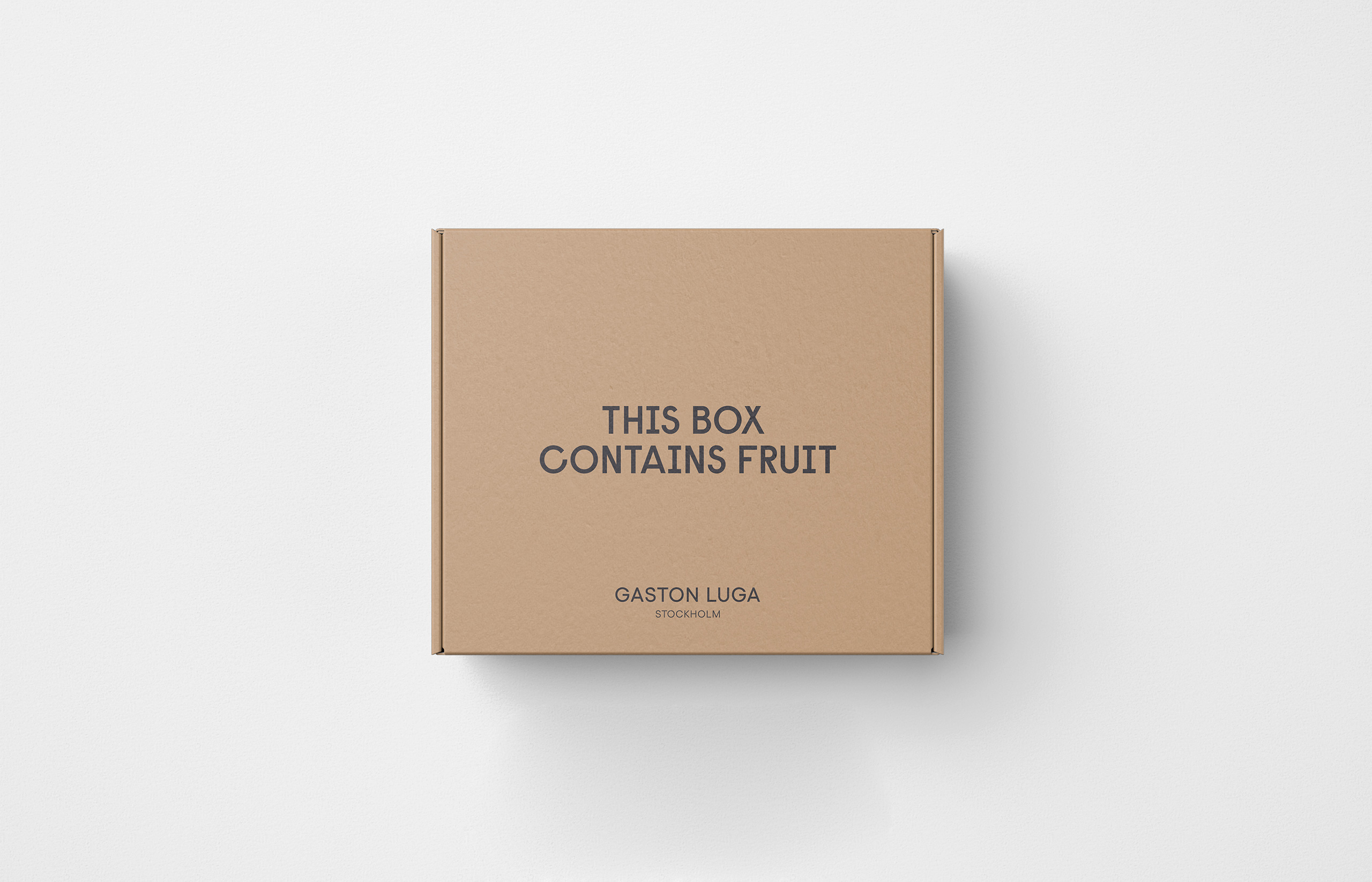
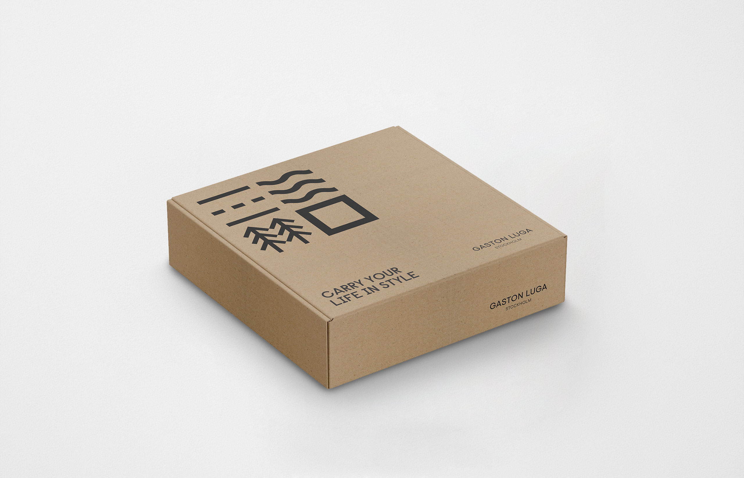
Many of the products that GL produce are made from discarded apple skin. Their wallet was one of them and so some creative copywriting was needed for the packaging.
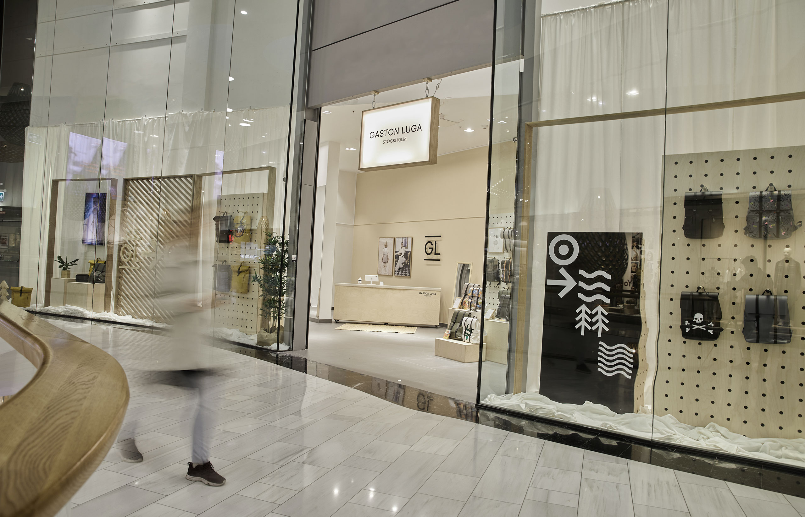
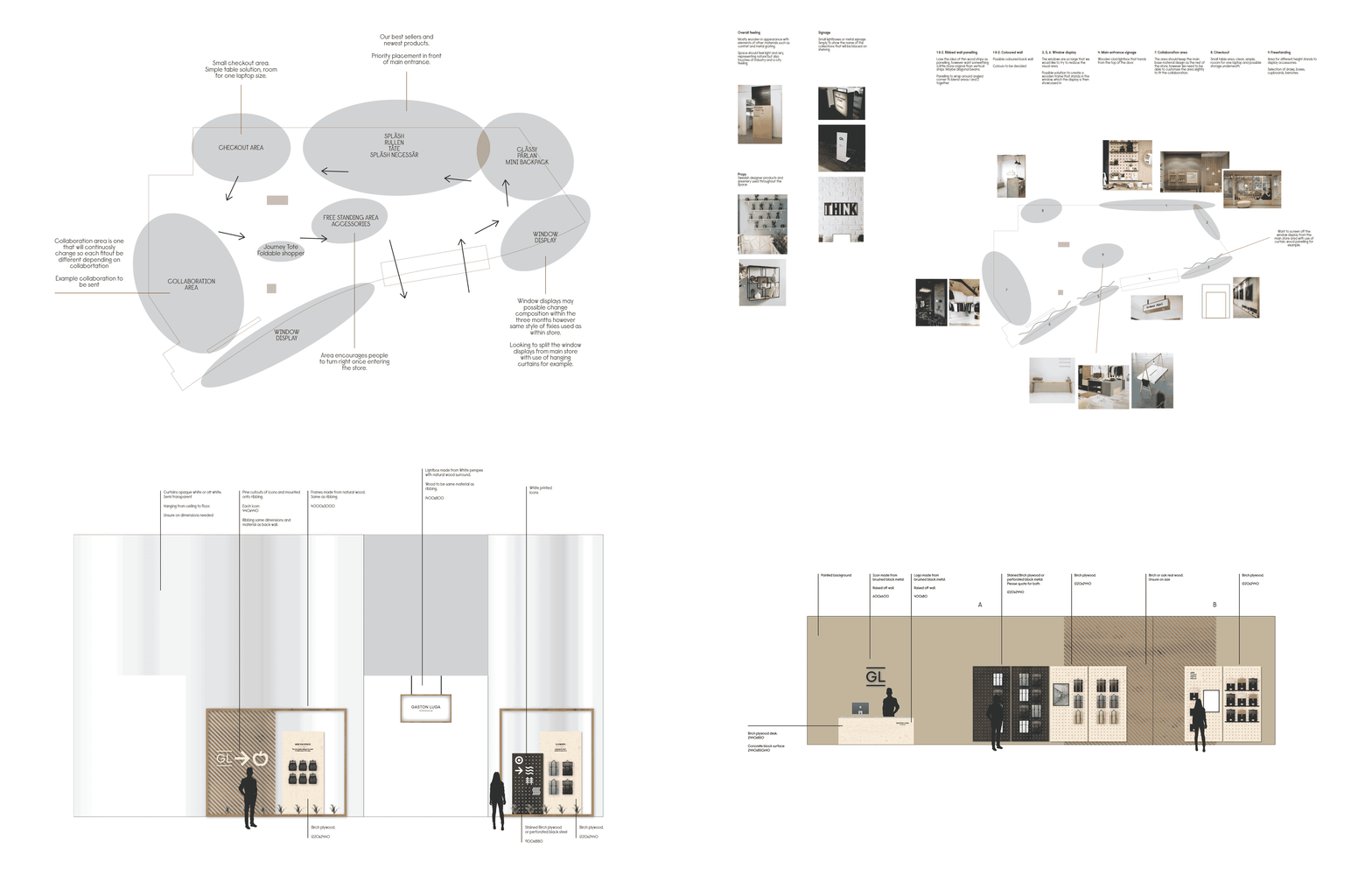
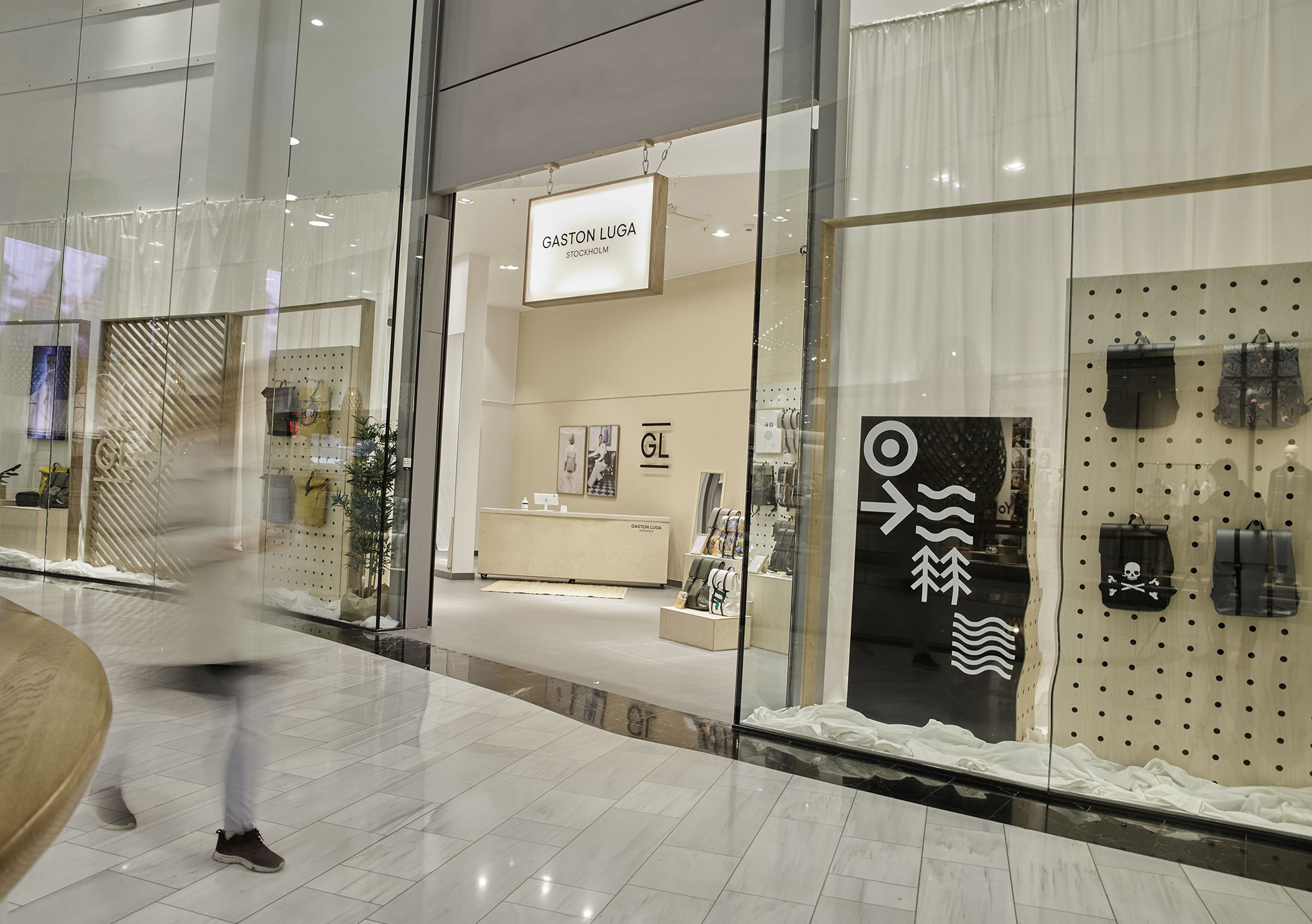
We designed a pop up store that was opened in the Mall of Scandinavia. This involved floor plans, looking at how customers move through the space and the design and fit out of the store.
